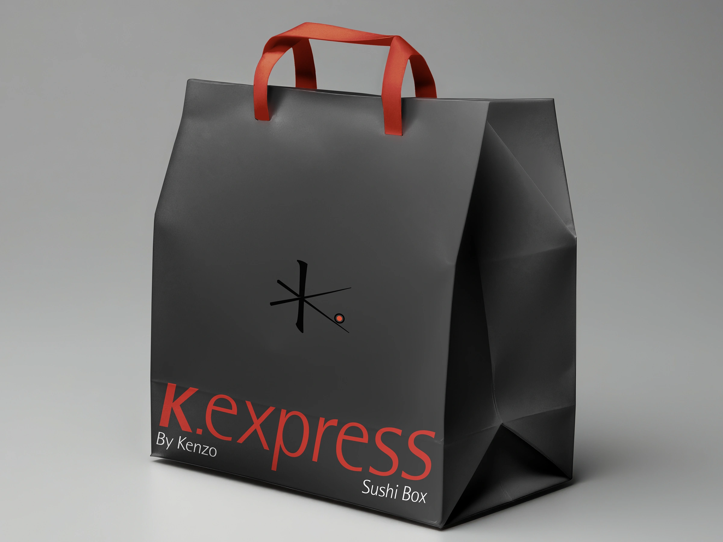
K Express
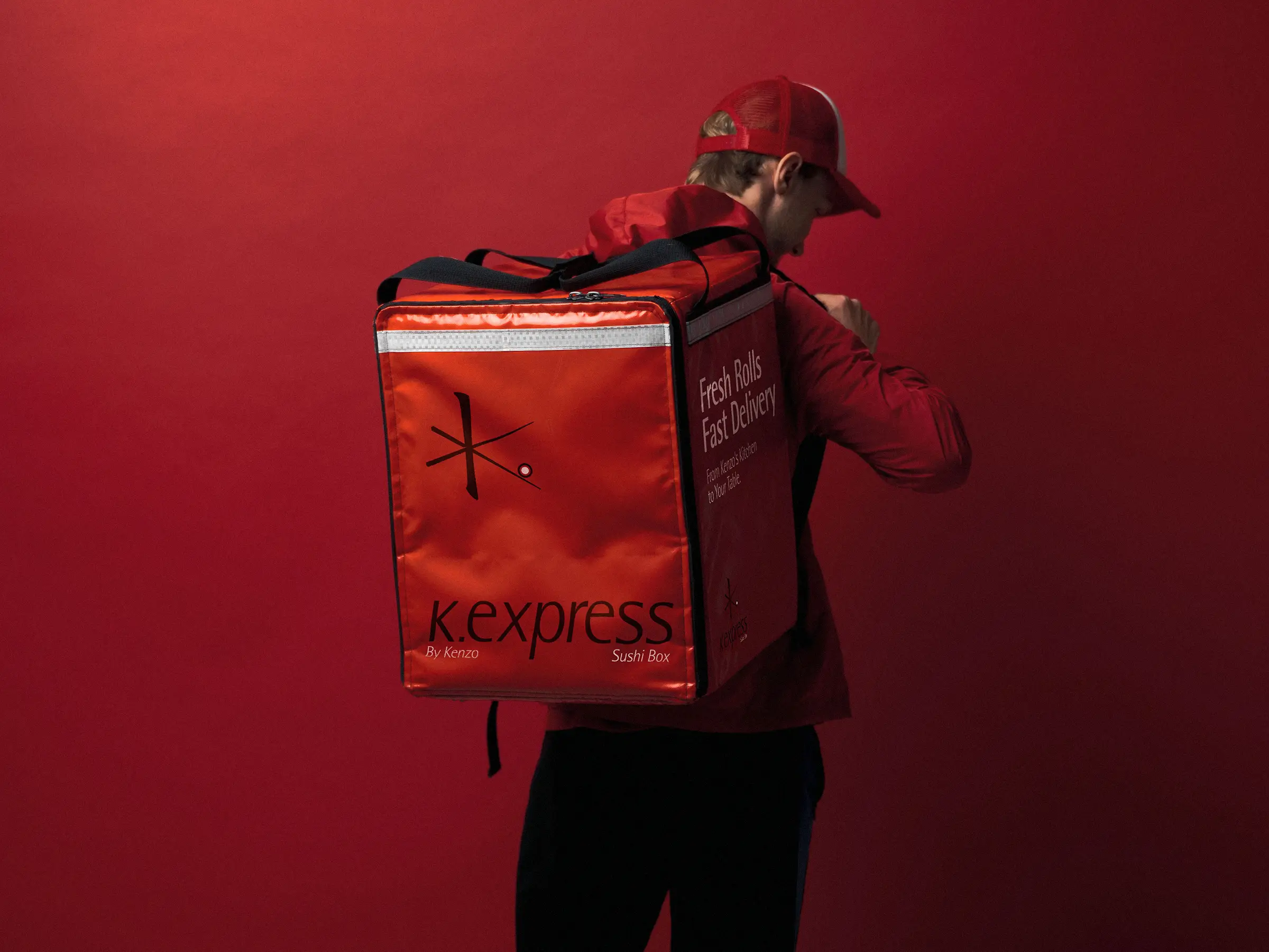
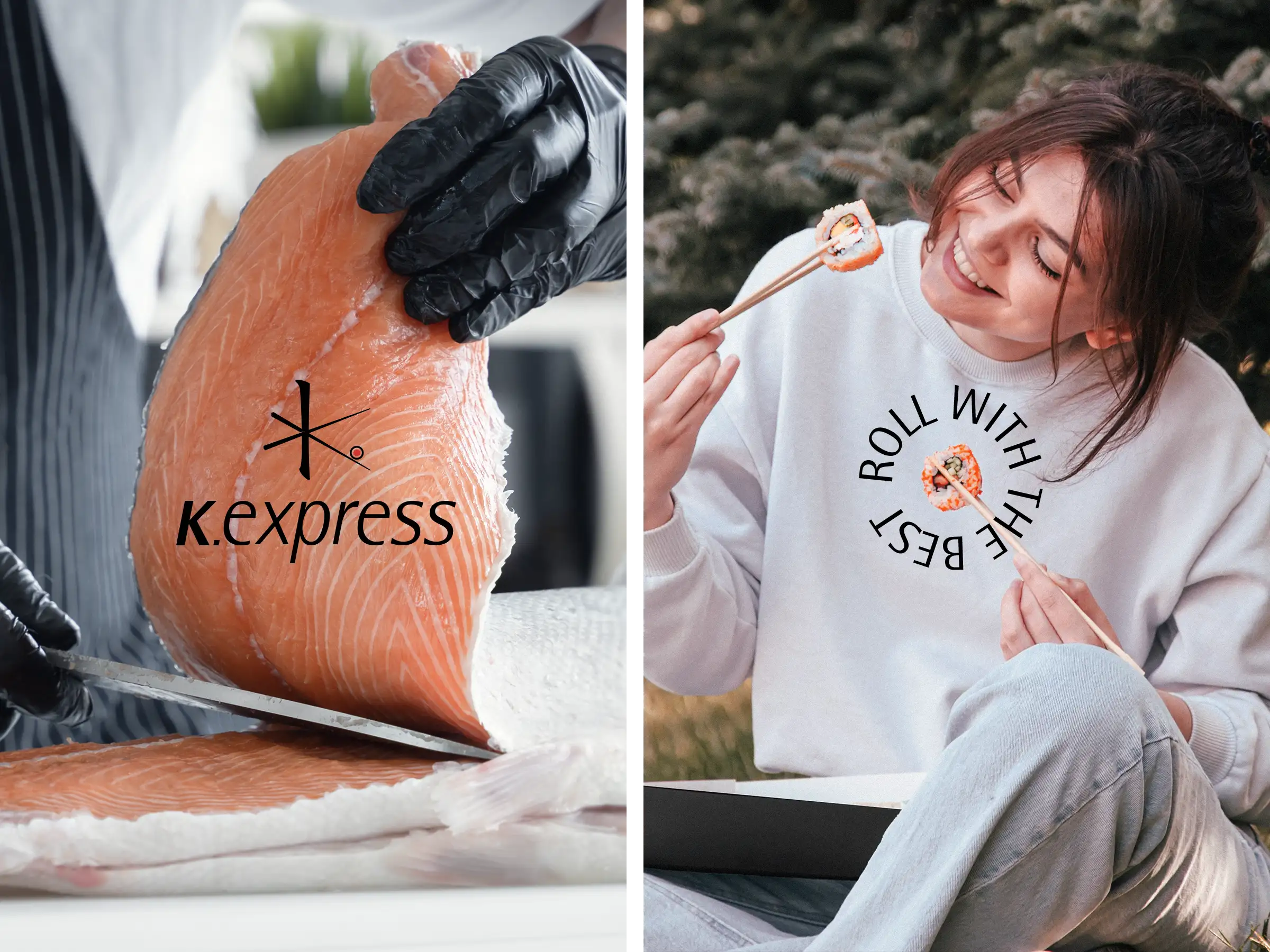
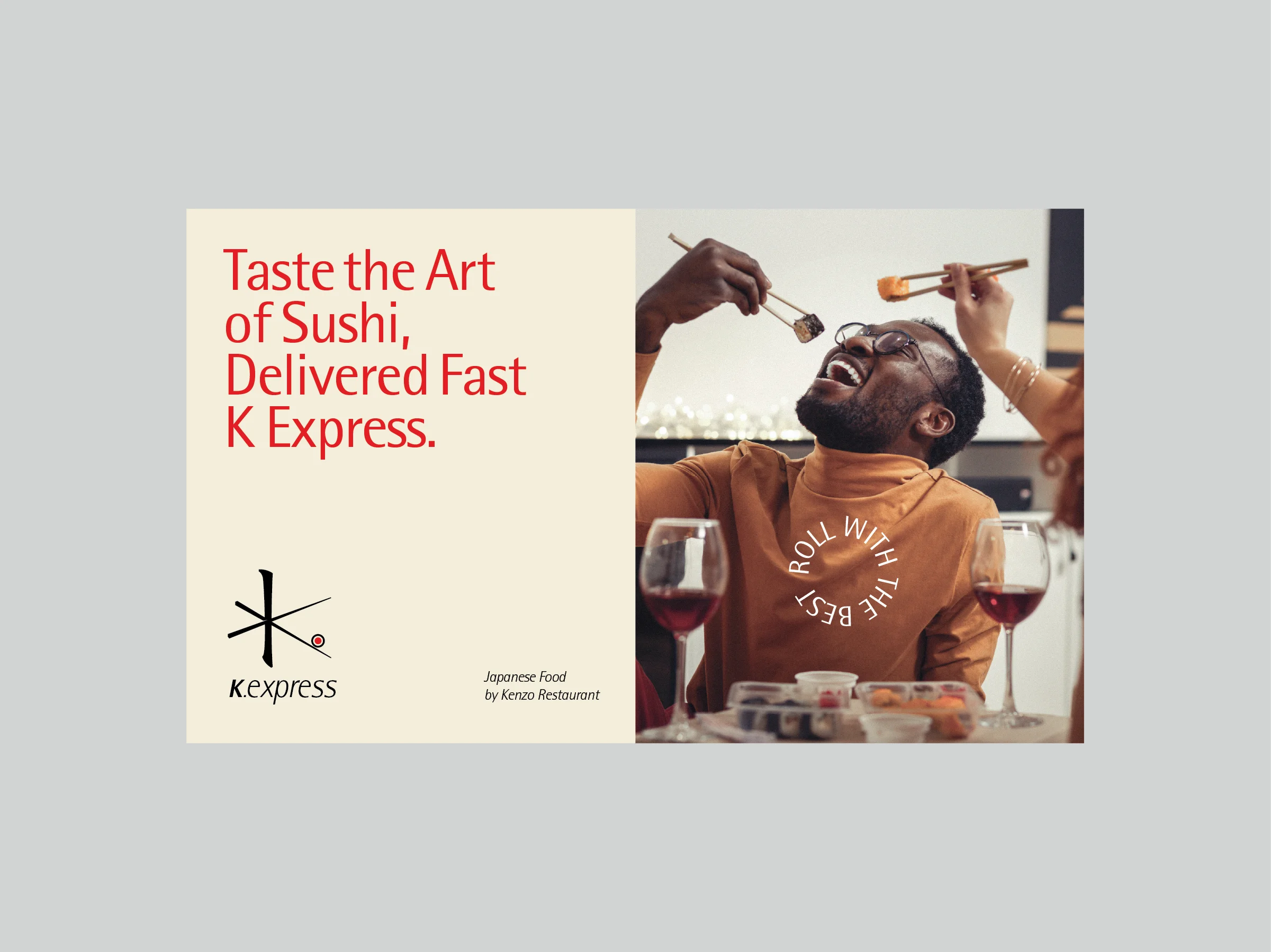
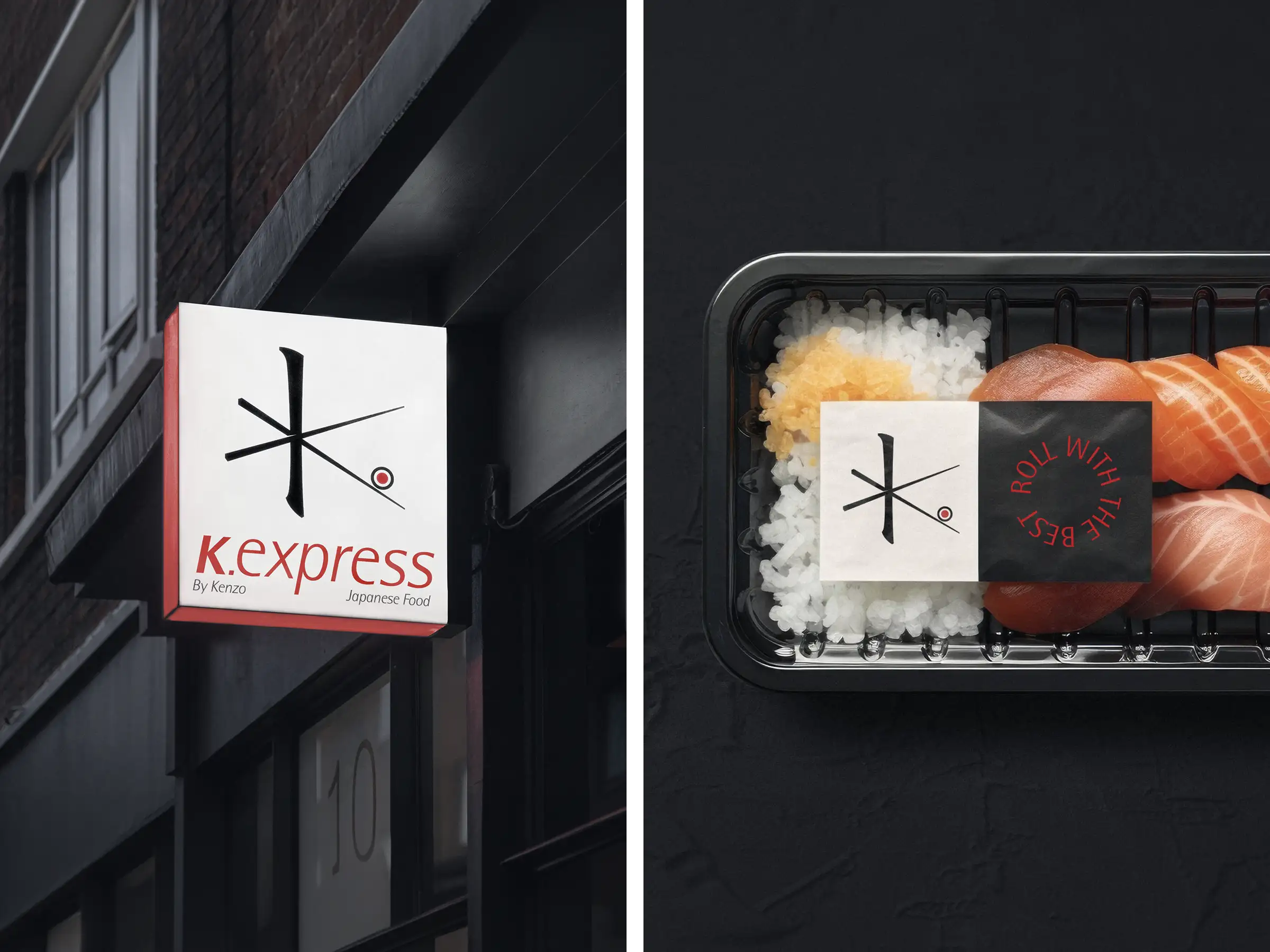
K Express or Kenzo Express, is an independent take-away branch of Kenzo Restaurants in Tehran. Established to manage the growing volume of orders from Kenzo Restaurants, K Express specializes in the delivery of high-quality Japanese and Asian cuisine. The brand is distinguished by its commitment to speed, food quality, and exceptional packaging
Logo and Visual Concept
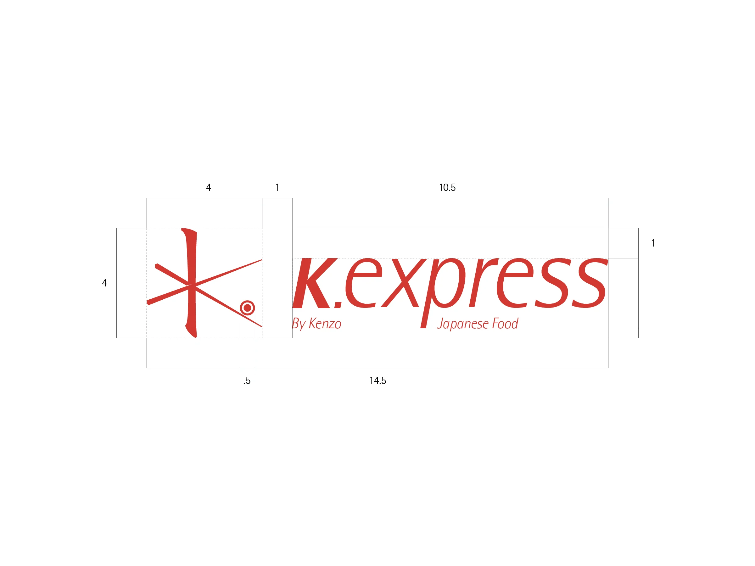
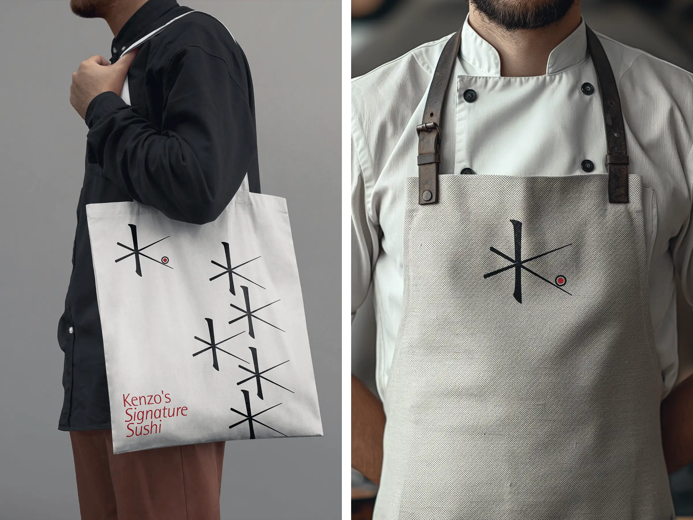
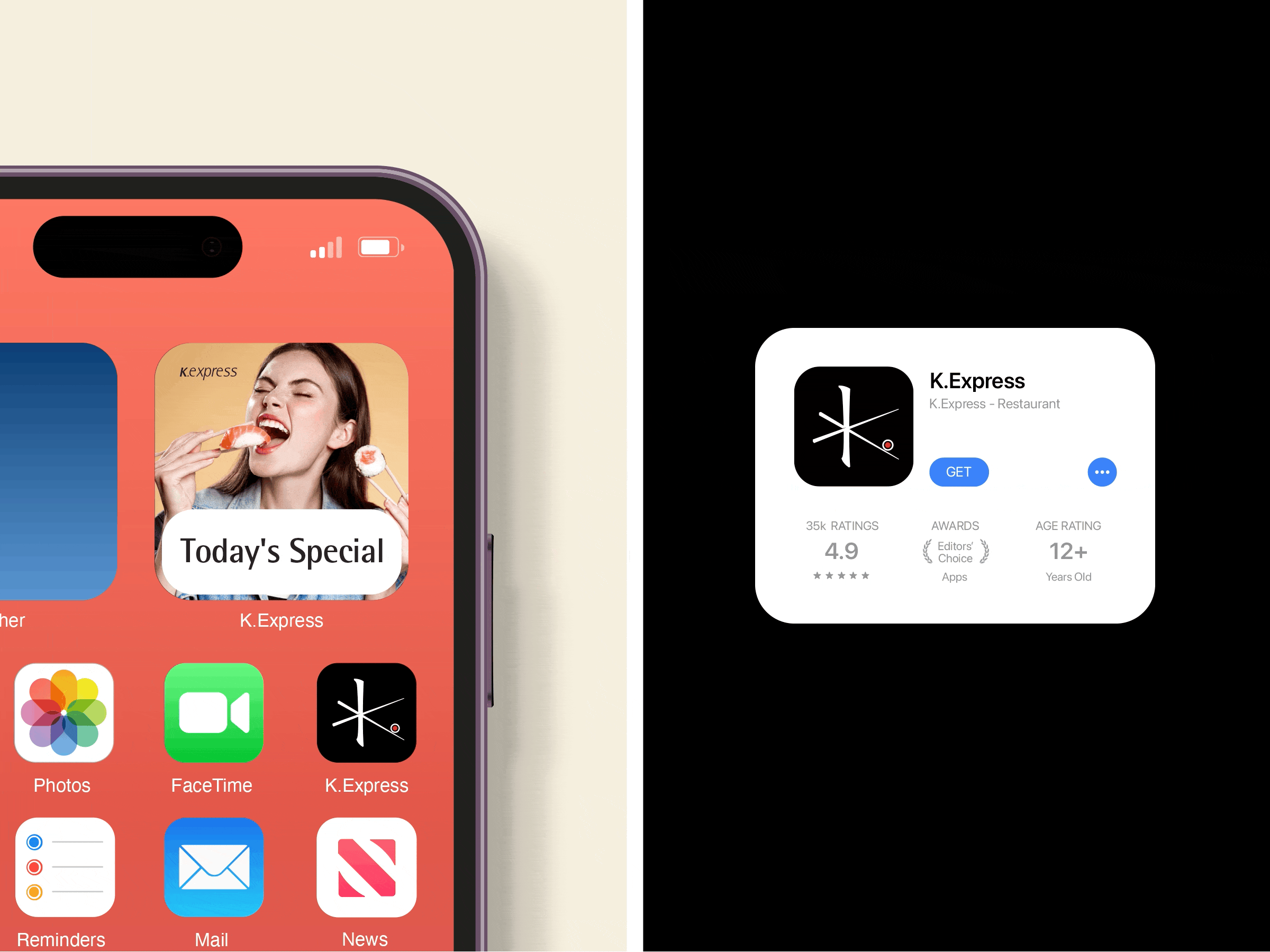
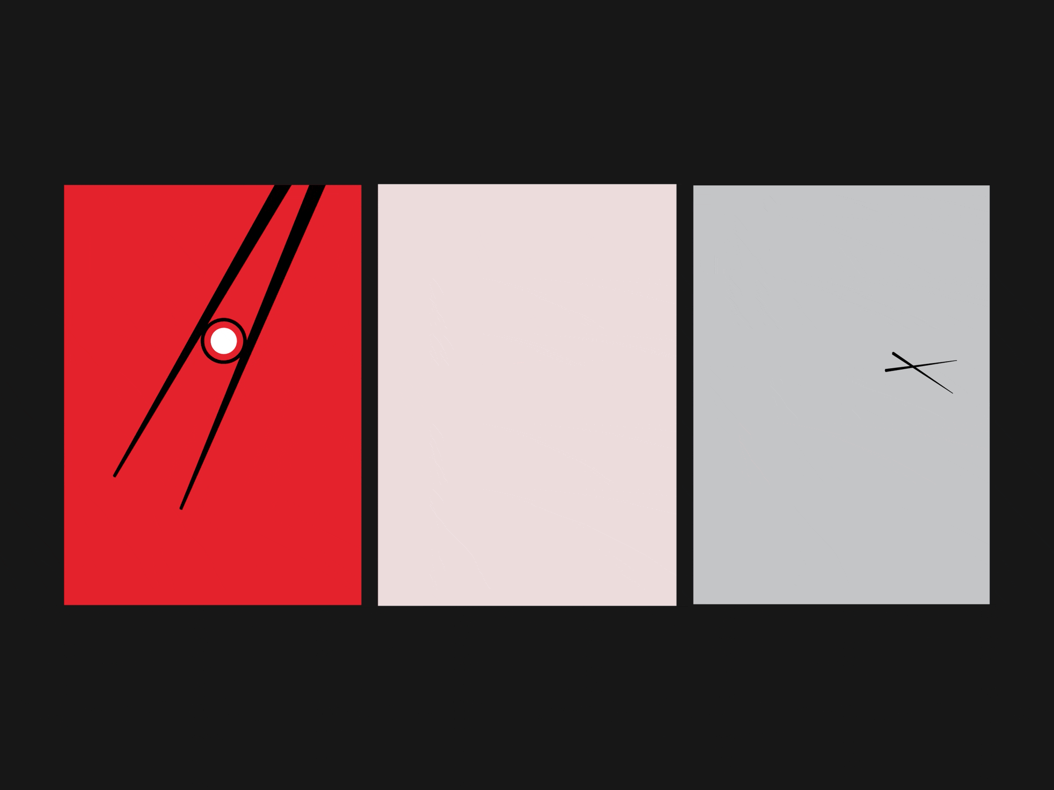
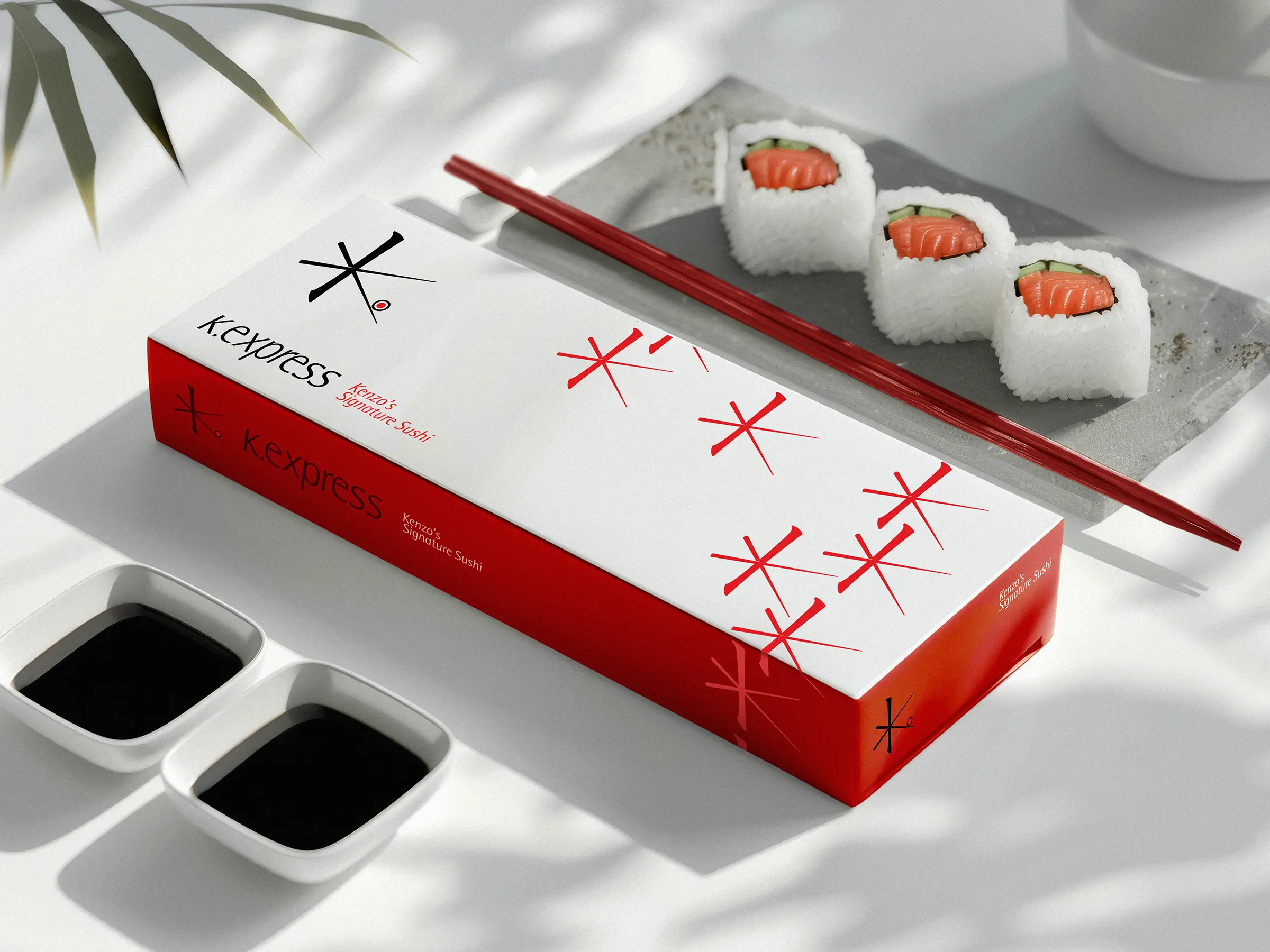
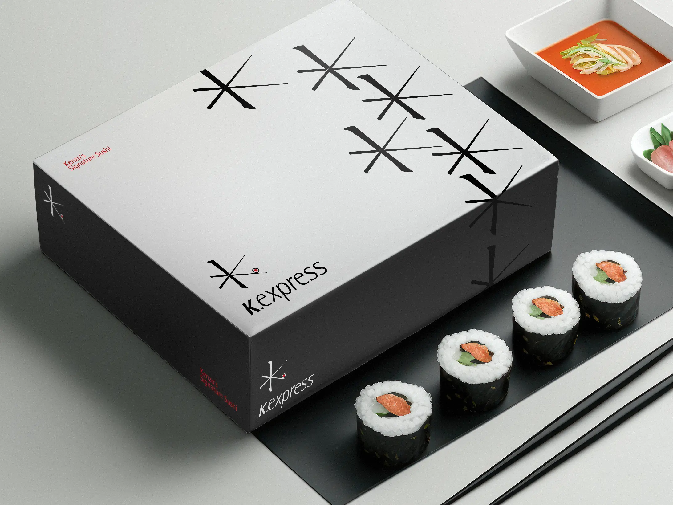
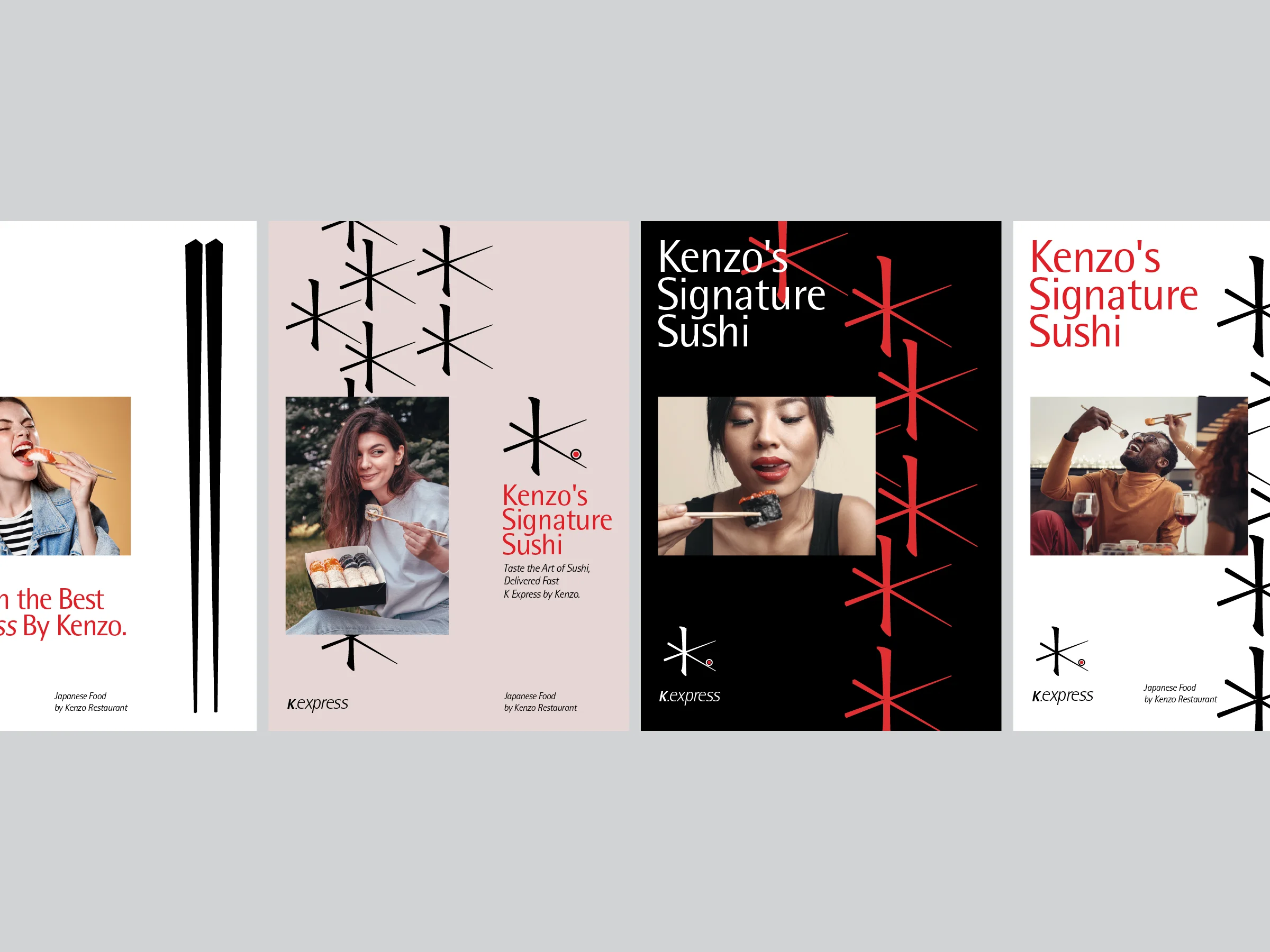
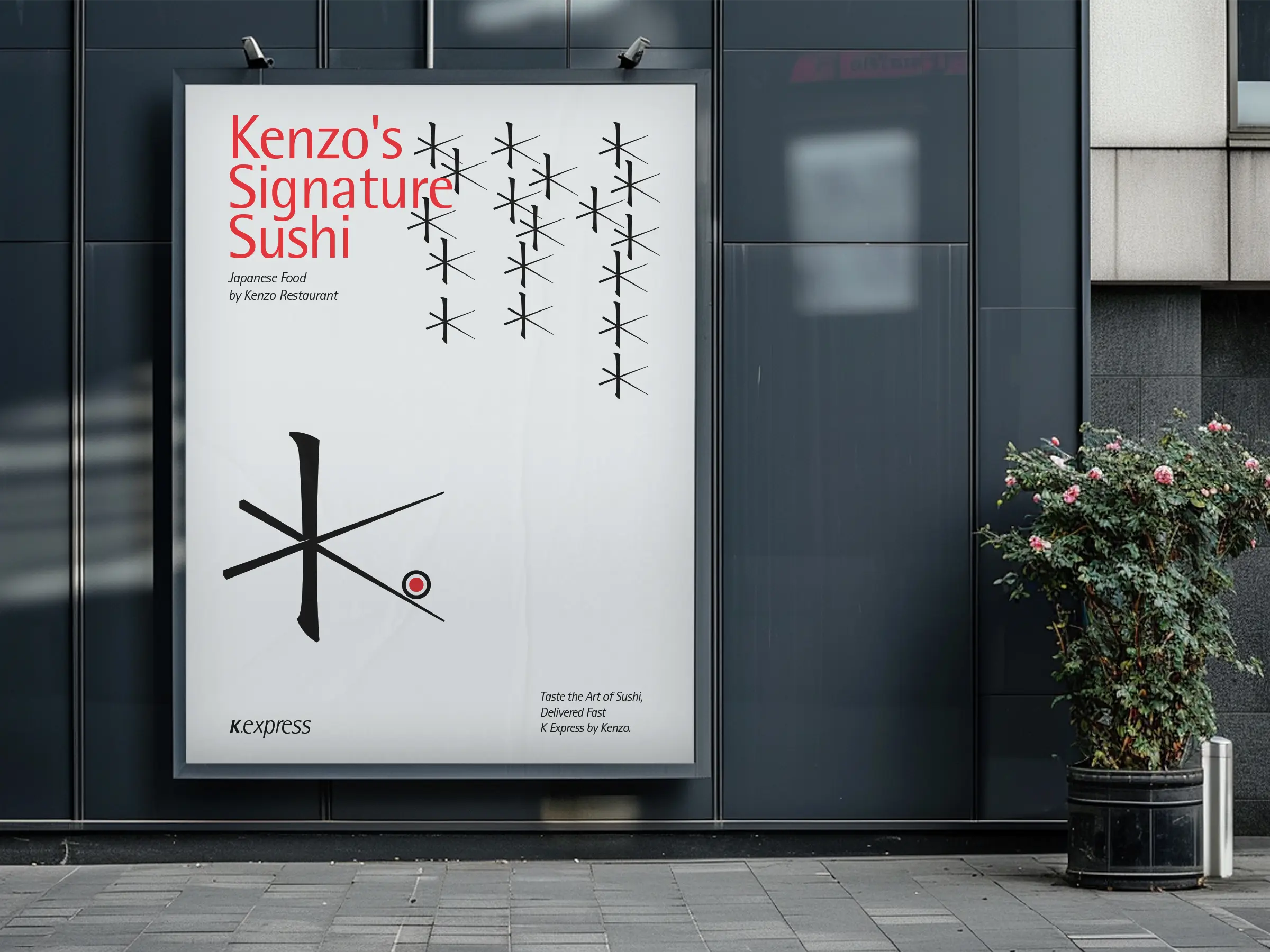
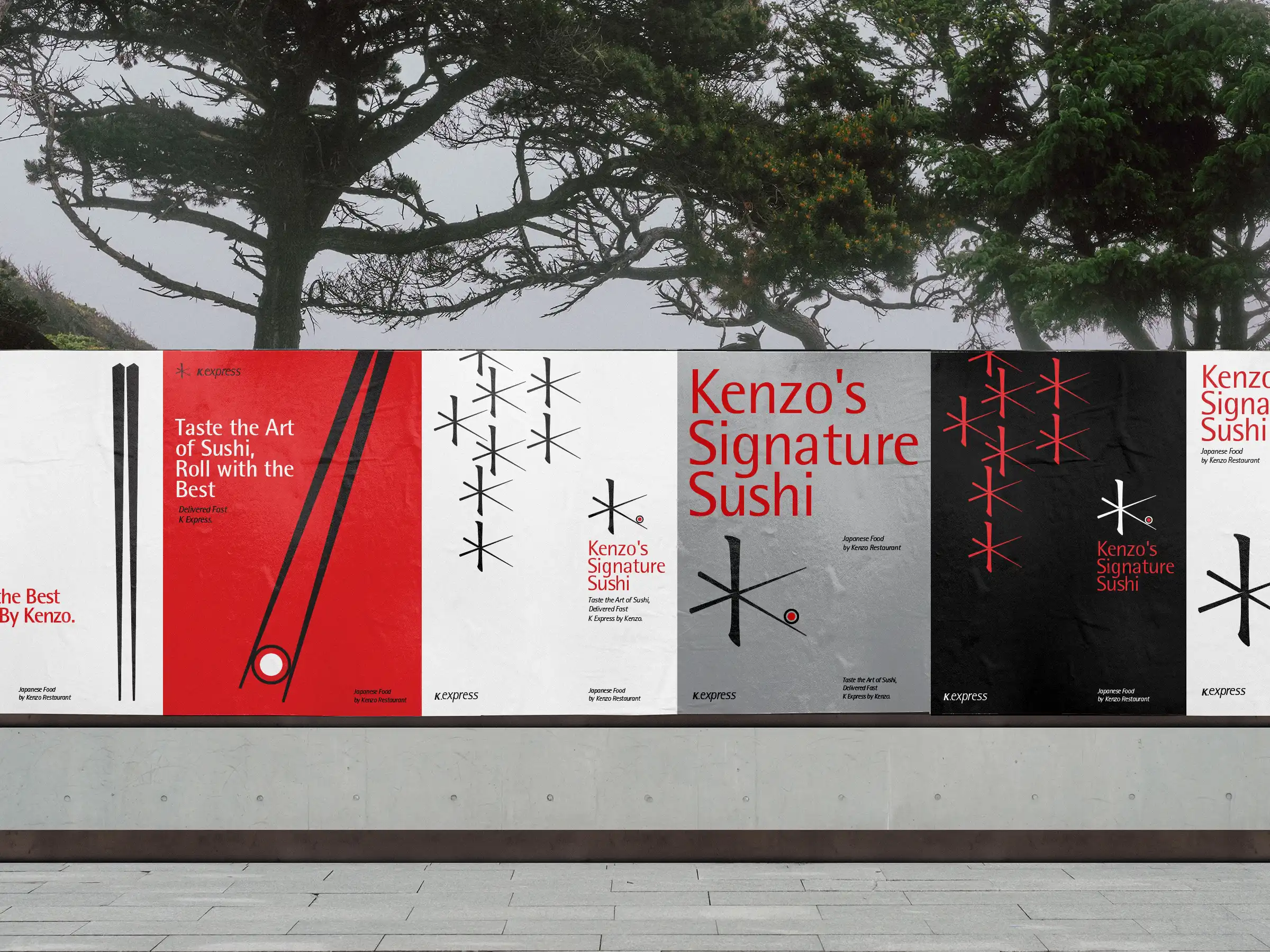
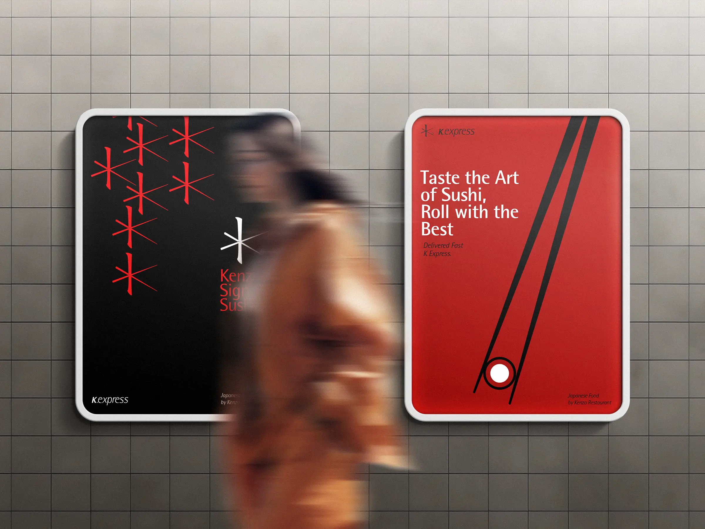
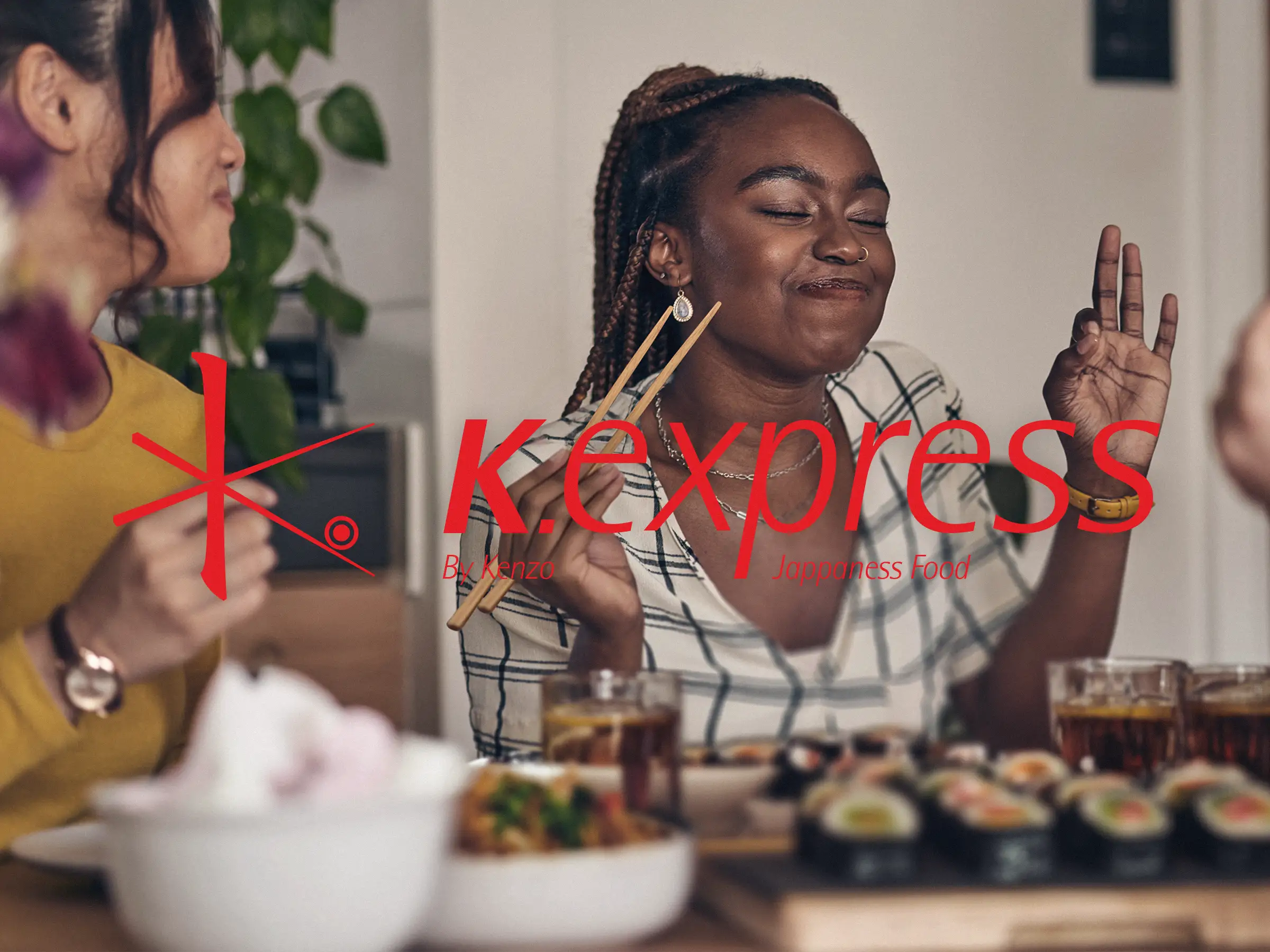
The visual identity of K Express was crafted to embody a distinctly Japanese and Asian essence. The logo design, inspired by chopsticks, sushi, and Japanese typography, forms a monogram of the letter "K" that captures the brand’s cultural spirit.
To reinforce the brand’s Japanese character, the visual identity features a repeated logo pattern reminiscent of Japanese script. The color palette—black, red, and shell white—along with the strategic use of elements like typography, evoke the essence of Japanese culture. The Rotis typeface was chosen for its sharp edges and elongated forms, aligning perfectly with the brand's visual goals.
Creativity & Brand Designer: Sahand Badeli